
13 Wedding Color Palettes for 2027 That I Cannot Stop Thinking About
/
By Kyle Wylde
If you are choosing your 2027 wedding colors and your saved folder currently contains five completely different weddings, I get it. The blue one is beautiful. So is the pink one. And then you see lilac with chocolate brown and suddenly you have a new personality.
I made this collection for that stage of planning. Thirteen wedding color palettes, each with a setting you can picture, four coordinating shades, and the little details I would use to bring it all together.
There is blue and butter yellow for a sunny lakeside wedding. Pistachio and pearl for a conservatory. Black cherry and ice blue for a romantic city reception. A few are soft, a few have more color, and there are several I would happily plan an entire wedding around.
Save the ones you love. Then look at them again with your venue in mind. That is where the decision starts to get easier.
What wedding colors feel fresh for 2027?
The color directions I am most excited to work with for 2027 are rich blues, pink with a darker accent, fresh greens, warm orange, and lilac paired with something unexpected. Soft ivory and warm neutrals give those colors room to breathe.
For a little context behind the collection, WGSN and Coloro's spring and summer 2027 forecast includes Luminous Blue, Energy Orange, Pop Pink, Meadowland Green, and Clay. Coloro's autumn and winter 2027 selection also includes Peaceful Lilac, Russet, Maize, and Deep Green. These are broader design and fashion color forecasts, which are a lovely starting point for wedding ideas.
The 13 combinations below are my own wedding palettes. The names and hex codes belong to this collection, rather than being official Pantone or Coloro matches. I wanted to take those color directions and make something you could actually picture on your wedding table.
Find your 2027 wedding color palette
Start with the combination that catches your eye, then jump to the styling notes.
Blue and butter yellow: Sapphire & Soufflé
Pink, sage green, and burgundy: Rosewater Social Club
Orange, blush pink, and olive: Orangerie Vows
Lilac, chocolate brown, and ice blue: Lilac After Hours
Pistachio green, citron, and ivory: Pearls & Pistachio
Dusty blue, dusty rose, and ivory: Something Blueberry
Coral pink, peach orange, and burgundy: Guava Gala
Champagne, French blue, and rose: Champagne Château
Teal, sea glass, and apricot: Teal Amour
Burgundy, blush pink, and ice blue: Cherry Silk
Lavender, chartreuse, and plum: Wisteria & Wasabi
Copper, dusty blue, and mulberry: Copper Moon
Golden yellow, cornflower blue, and olive: Marigold Muse
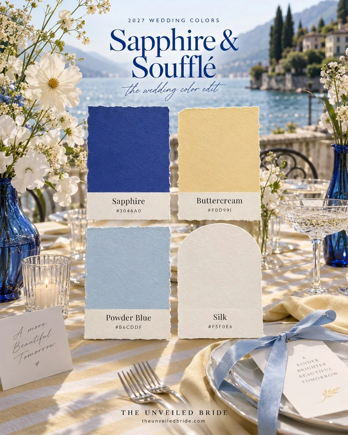
1. Sapphire & Soufflé: Blue and Butter Yellow Wedding Colors
This is the one I would send to the bride who loves blue but wants a little more sunshine. The sapphire gives it presence, the buttercream warms everything up, and the powder blue keeps the whole thing soft enough for a wedding. I love it with striped linens, clear glass, and flowers that look like they were just gathered from a very beautiful garden.
The colors: Sapphire #3046A0; Buttercream #F0D991; Powder Blue #B6CDDF; Silk #F5F0E6.
I would use it for: Lakeside, coastal, and European-inspired weddings. Season ideas: Spring and summer.
How I would style it
Let buttercream and silk cover the larger surfaces. Bring in sapphire through vases, ribbon, or the invitation lettering, then use powder blue for napkins or bridesmaid dresses. You get that gorgeous blue-and-yellow combination without every single thing competing for attention.
The detail I love: A butter-yellow stripe. It makes the table feel dressed before you have added a single flower.
2. Rosewater Social Club: Pink, Sage Green, and Burgundy Wedding Colors
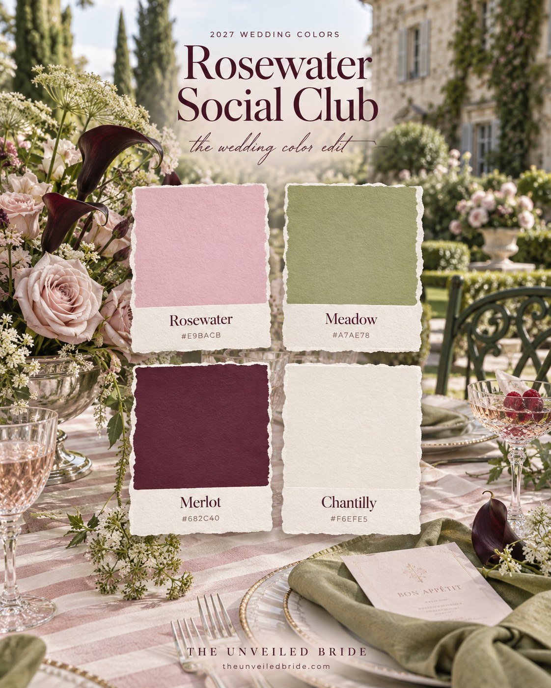
Pink and green will always have my heart, but the merlot is what makes this version interesting. It gives the softer colors somewhere to land. Think pink striped linen, a meadow-green napkin, a silver bowl of roses, and just a few dark calla lilies. Very garden wedding. Very much worth zooming in on.
The colors: Rosewater #E9BACB; Meadow #A7AE78; Merlot #682C40; Chantilly #F6EFE5.
I would use it for: Garden parties and romantic estate weddings. Season ideas: Spring through early fall.
How I would style it
Use rosewater and chantilly as the foundation, with meadow green in the fabric and foliage. Keep merlot to smaller, deliberate details: a ribbon, the menu type, or a few flowers. Too much of the dark color will change the whole mood, which is lovely if that is what you want.
The detail I love: Pink stripes with burgundy lettering on the stationery. Such a good combination.
3. Orangerie Vows: Orange, Blush Pink, and Olive Wedding Colors
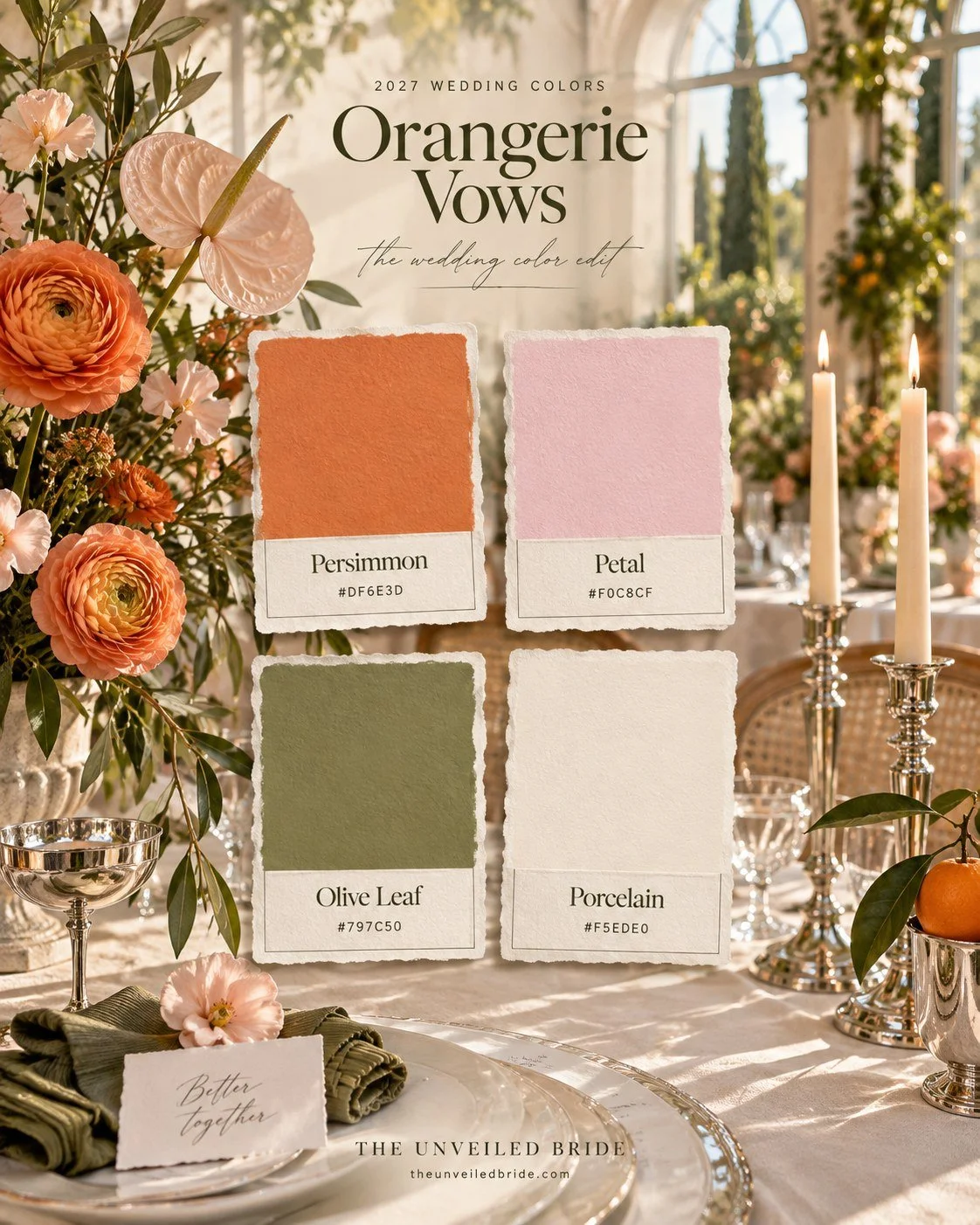
Orange can be so beautiful at a wedding, especially when you give it this softer pink to sit beside. Persimmon and petal feel warm and a little playful, while olive pulls the palette back toward the garden. I picture long tables, afternoon light through tall windows, and flowers with really beautiful shapes.
The colors: Persimmon #DF6E3D; Petal #F0C8CF; Olive Leaf #797C50; Porcelain #F5EDE0.
I would use it for: Orangeries, courtyards, and Mediterranean weddings. Season ideas: Spring, summer, and early fall.
How I would style it
Keep the linen porcelain and let the floral arrangement carry most of the orange and pink. Olive napkins are an easy way to repeat the green without filling the table with greenery. A little citrus branch would be lovely, but the table does not need to become a fruit stand.
The detail I love: A blush anthurium beside an orange ranunculus. The shapes are as good together as the colors.
4. Lilac After Hours: Lilac, Chocolate Brown, and Ice Blue Wedding Colors
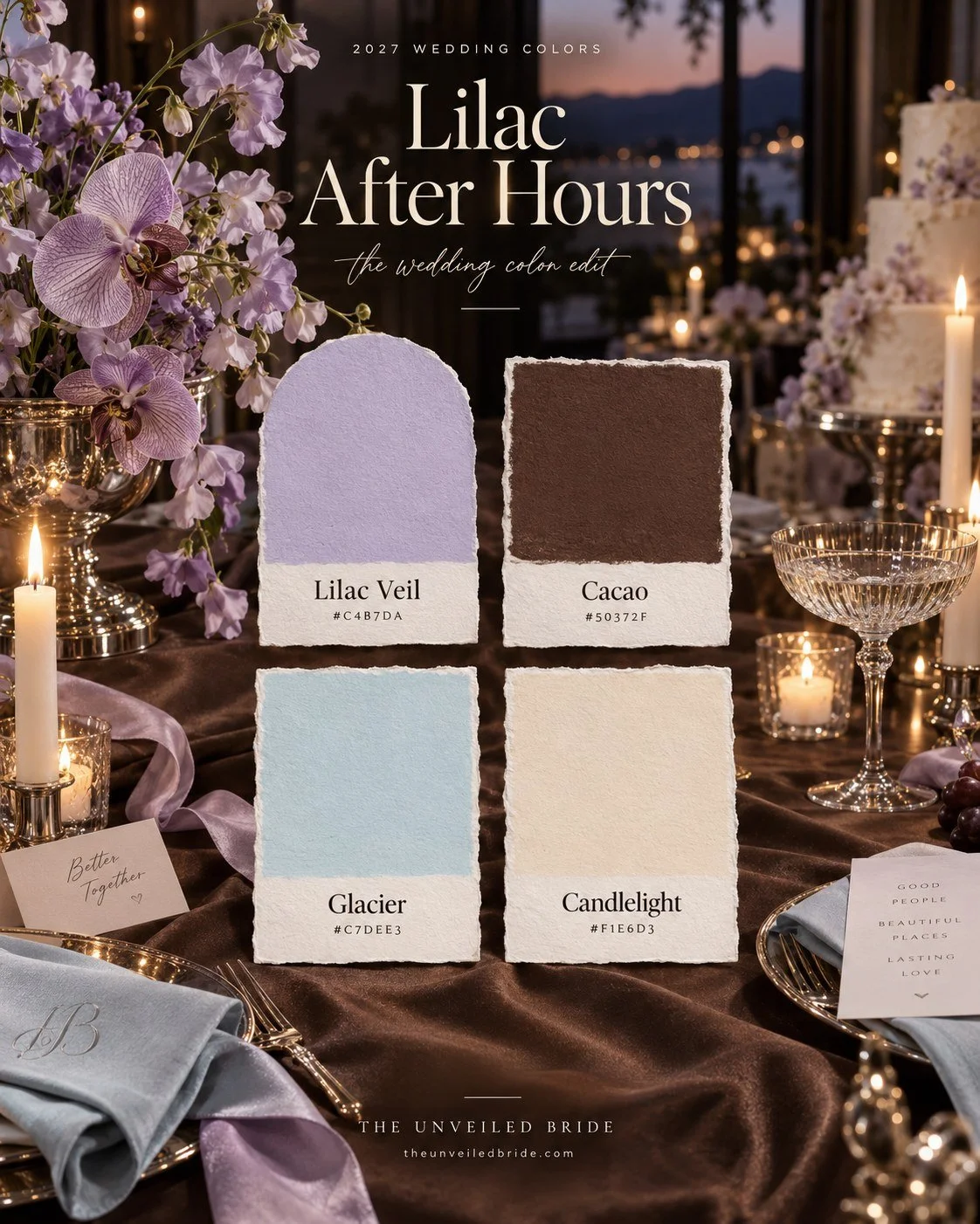
Okay, lilac and chocolate brown. I am obsessed. The lilac feels even prettier against that rich cacao, and the glacier blue gives the palette a cool little lift. It is romantic in a slightly unexpected way, especially with silver, silk, and a table full of candlelight.
The colors: Lilac Veil #C4B7DA; Cacao #50372F; Glacier #C7DEE3; Candlelight #F1E6D3.
I would use it for: Intimate dinners and candlelit receptions. Season ideas: Fall and winter, or an evening wedding in any season.
How I would style it
Try cacao as the table linen, lilac in the flowers, and glacier in the napkins. Keep the candles and paper warm ivory. If a dark tablecloth feels like too much, flip it: use candlelight linen and cacao ribbon or menu lettering. You still get the combination, just with a lighter overall feel.
The detail I love: Lilac sweet peas against brown silk. I would happily build the whole table around that.
5. Pearls & Pistachio: Pistachio Green, Citron, and Ivory Wedding Colors
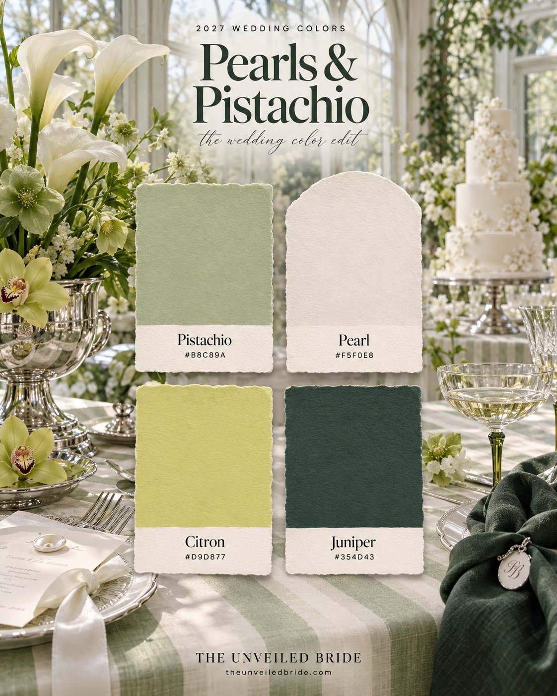
For the bride whose saved folder is mostly white flowers and beautiful gardens, this is such a pretty way to bring in color. Pistachio is soft, citron adds a little brightness, and juniper gives the palette depth. It still feels wonderfully fresh and bridal.
The colors: Pistachio #B8C89A; Pearl #F5F0E8; Citron #D9D877; Juniper #354D43.
I would use it for: Conservatories, greenhouses, and botanical weddings. Season ideas: Spring and summer.
How I would style it
Start with pearl linens or a subtle green stripe, then work pistachio into the paper or bridesmaid dresses. Use juniper for napkins or ribbon and citron sparingly in the flowers. You do not need three shades of green in every arrangement. Let them appear in different places around the wedding.
The detail I love: Green-stemmed glassware. A small detail that looks lovely even when the table is barely decorated.
6. Something Blueberry: Dusty Blue, Dusty Rose, and Ivory Wedding Colors
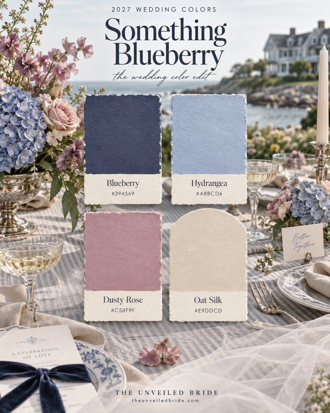
Something blue, with a little more personality. Blueberry is deeper and softer than a bright royal blue, and the dusty rose makes the whole palette feel romantic. I love this for a coastal wedding with blue-and-white plates, silver, and flowers that have some movement to them.
The colors: Blueberry #394569; Hydrangea #A8BCD6; Dusty Rose #C58F9F; Oat Silk #E9DDCD.
I would use it for: Coastal estates and classic seaside weddings. Season ideas: Spring and summer.
How I would style it
Use hydrangea and oat silk for the larger pieces, then bring blueberry into ribbon and printed details. Dusty rose works beautifully in the bouquet or a mix of bridesmaid dresses. If your venue already has a lot of blue, the oat and rose will help keep the room from feeling one-note.
The detail I love: A blueberry velvet bow around an ivory menu. Especially good beside patterned china.
7. Guava Gala: Coral Pink, Peach Orange, and Burgundy Wedding Colors
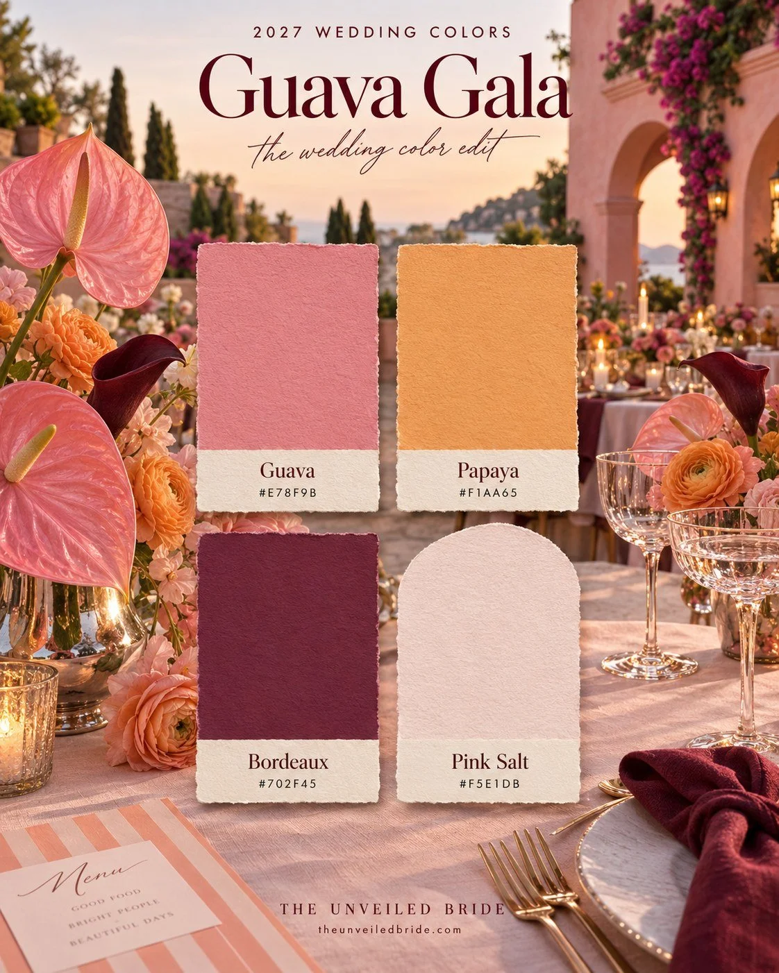
This one makes me want to book a pink hotel and have dinner outside. Guava and papaya are warm and happy, but that little bit of Bordeaux gives them a gorgeous richness. It is a really fun choice for the bride who wants color to be a big part of the day.
The colors: Guava #E78F9B; Papaya #F1AA65; Bordeaux #702F45; Pink Salt #F5E1DB.
I would use it for: Destination weddings and colorful courtyard receptions. Season ideas: Spring and summer.
How I would style it
Let pink salt be the quieter base, then use guava and papaya together in the flowers. Add Bordeaux through a napkin or ribbon so the whole table has some contrast. With flowers this colorful, clear glass and simple plates give your eye somewhere to rest.
The detail I love: A papaya-and-pink striped menu. Cute enough to keep after the wedding.
8. Champagne Château: Champagne, French Blue, and Rose Wedding Colors
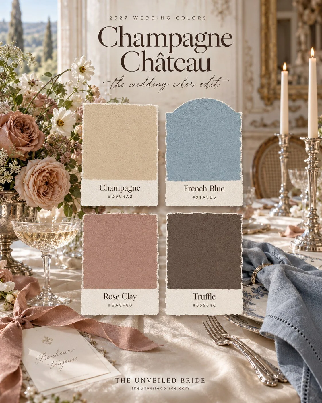
If you love a softer wedding palette but still want it to feel considered, start here. Champagne and rose clay bring warmth, French blue keeps it from feeling too beige, and truffle is the quiet darker shade that ties it together. It feels lovely with old stone, silk, and silver.
The colors: Champagne #D9C4A2; French Blue #91A9B5; Rose Clay #BA8F80; Truffle #65564C.
I would use it for: Historic estates and elegant indoor weddings. Season ideas: Any season.
How I would style it
Use champagne for the linen, French blue for the napkins, and rose clay in the flowers or ribbon. Truffle is beautiful for the invitation and menu lettering. You can also work in blue-and-white china if you want a little pattern without introducing another color.
The detail I love: A French blue napkin with a delicate hemstitched edge. Sometimes that really is enough.
9. Teal Amour: Teal, Sea Glass, and Apricot Wedding Colors
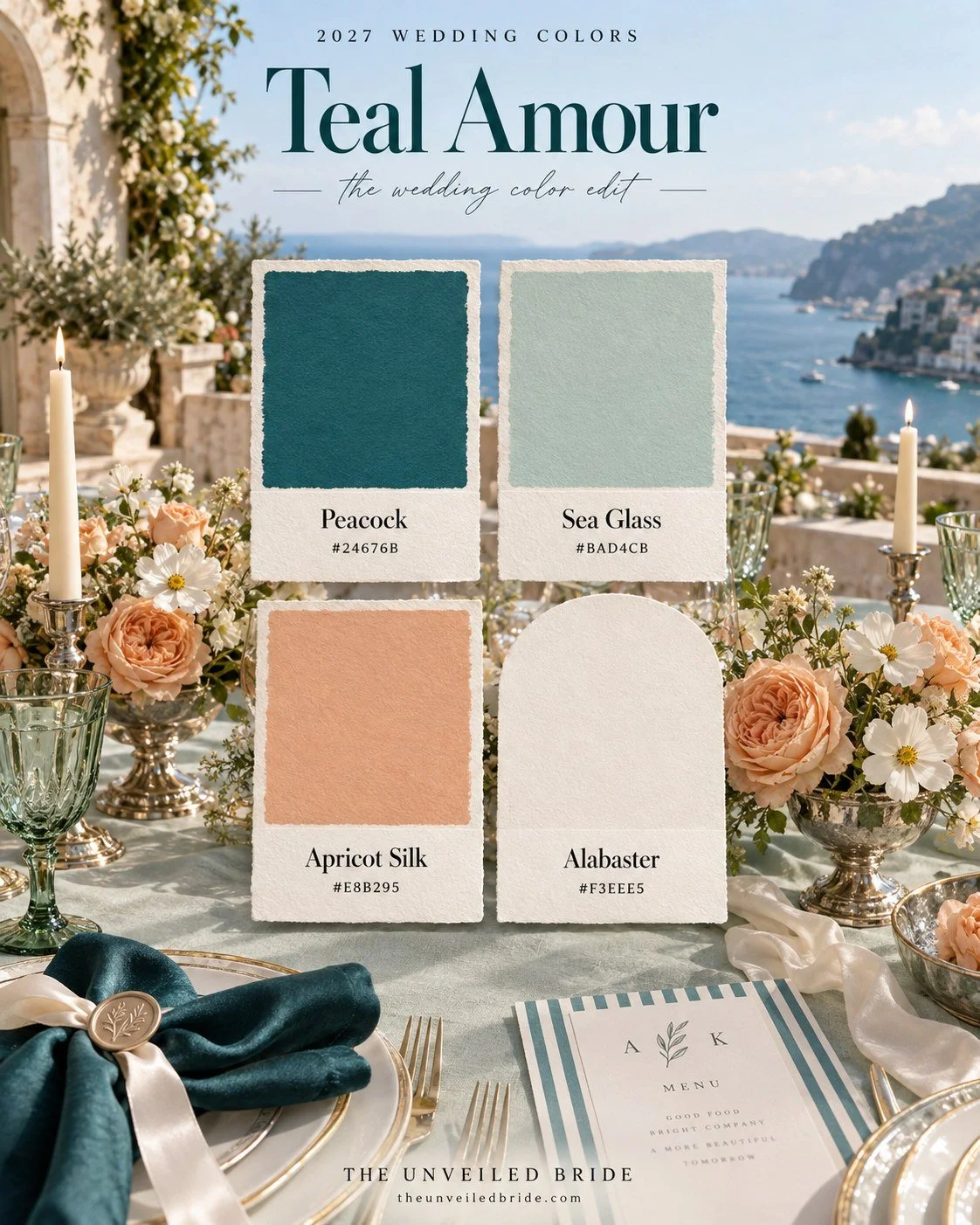
Teal and apricot are so good together. The peacock shade gives this palette a beautiful richness, while sea glass makes it feel light and coastal. Apricot brings in just enough warmth. I would love to see this at a waterfront wedding, but it would be equally pretty in a bright garden venue.
The colors: Peacock #24676B; Sea Glass #BAD4CB; Apricot Silk #E8B295; Alabaster #F3EEE5.
I would use it for: Coastal villas and waterfront weddings. Season ideas: Spring and summer.
How I would style it
Try sea glass linen, apricot flowers, and peacock napkins or ribbon. Alabaster gives the bouquet and stationery a soft neutral. Keep an eye on the teal fabric samples: a very blue teal and a very green teal will give you quite different versions of this look.
The detail I love: Peacock-and-ivory stripes on the stationery, with a tiny apricot floral detail.
10. Cherry Silk: Burgundy, Blush Pink, and Ice Blue Wedding Colors
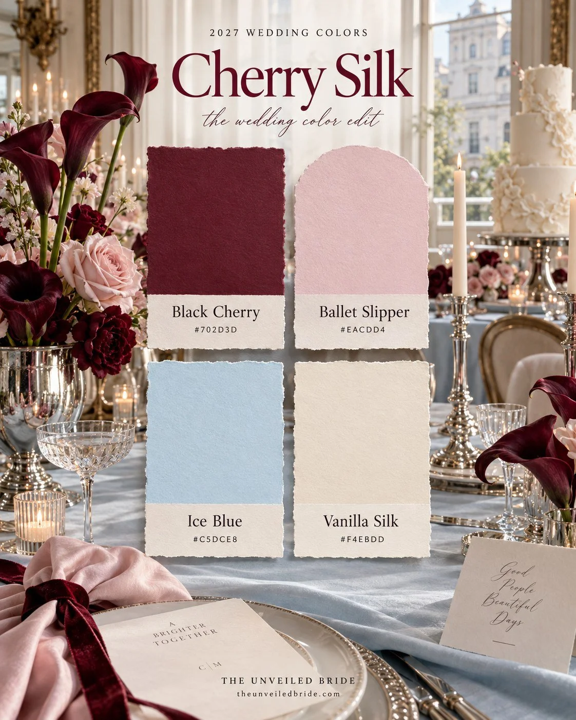
Black cherry with ice blue might be my favorite little surprise in this whole collection. The pink makes it romantic, the cherry makes it feel dressed up, and the blue keeps it crisp. It is such a pretty option if you love burgundy but do not want an entirely dark wedding palette.
The colors: Black Cherry #702D3D; Ballet Slipper #EACDD4; Ice Blue #C5DCE8; Vanilla Silk #F4EBDD.
I would use it for: Townhouses, city venues, and romantic formal receptions. Season ideas: Fall and winter, or a formal spring wedding.
How I would style it
Give ice blue the larger role in the linens, then repeat ballet pink in napkins or flowers. Use black cherry for a few statement blooms and velvet ribbon. Vanilla silk keeps the paper and candles warm. The key is leaving plenty of light color around the darker accents.
The detail I love: A cherry velvet ribbon tied around a ballet-pink napkin. Absolutely keeping that idea.
11. Wisteria & Wasabi: Lavender, Chartreuse, and Plum Wedding Colors
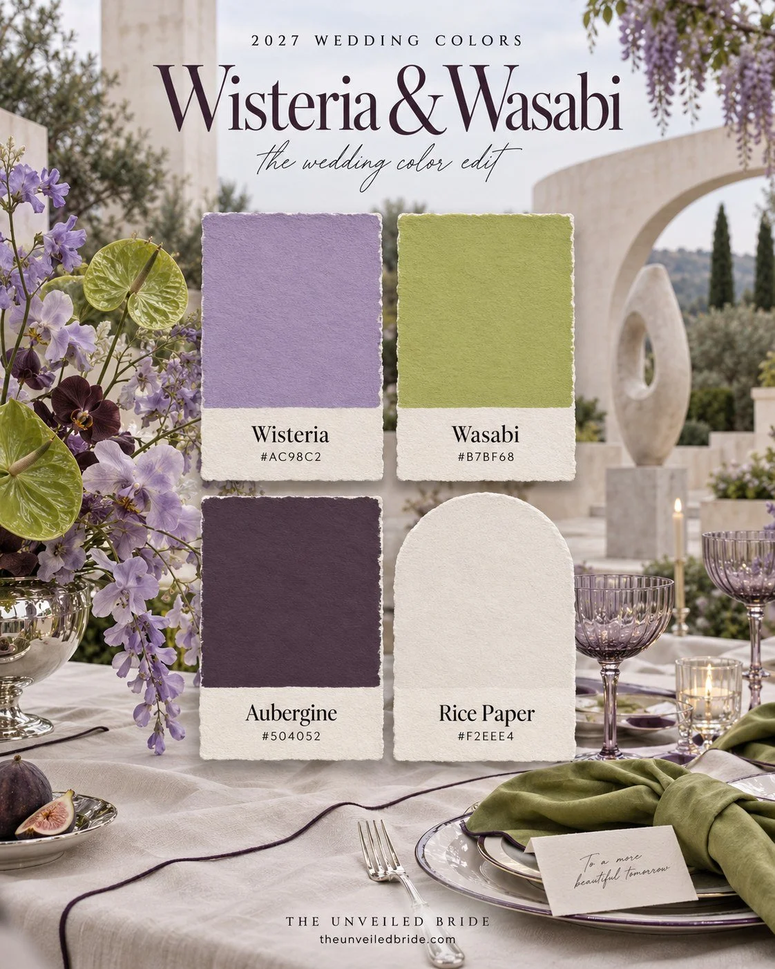
This is for the bride who sees lavender and bright green together and immediately gets it. The wasabi makes the wisteria feel a little unexpected, and aubergine gives both colors some depth. I love the idea of using this in a space with interesting architecture and really intentional flowers.
The colors: Wisteria #AC98C2; Wasabi #B7BF68; Aubergine #504052; Rice Paper #F2EEE4.
I would use it for: Modern gardens, galleries, and sculptural venues. Season ideas: Spring and summer.
How I would style it
Use rice paper as the base and let wisteria be the main floral color. Add wasabi in the napkins or a few sculptural flowers, then aubergine in the lettering or glassware. Ask your florist for a mix of shapes and some open space between the stems. This palette does not need a huge arrangement to make an impression.
The detail I love: A thin aubergine border on ivory linen or stationery. It makes the brighter colors feel beautifully framed.
12. Copper Moon: Copper, Dusty Blue, and Mulberry Wedding Colors
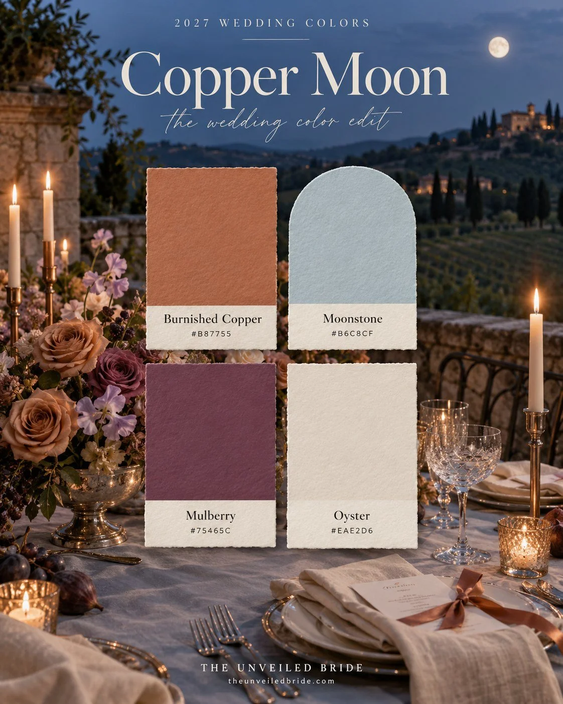
For an autumn wedding, I love this softer mix of copper, cool blue, and mulberry. It has all that warm evening feeling, but the moonstone adds a little air. Picture toffee roses, soft blue linen, a few copper candlesticks, and dinner that carries on after the sky turns dark.
The colors: Burnished Copper #B87755; Moonstone #B6C8CF; Mulberry #75465C; Oyster #EAE2D6.
I would use it for: Vineyards and evening receptions. Season ideas: Fall and winter.
How I would style it
Let moonstone and oyster do most of the work in the fabrics. Bring copper and mulberry into the flowers, ribbon, and candleholders. The copper hex is a flat color reference, so pair it with an actual metal sample if you are choosing metallic decor. A shiny copper finish will read differently from a matte ribbon.
The detail I love: Moonstone linen under candlelight. That warm-and-cool contrast is the whole reason I love this one.
13. Marigold Muse: Golden Yellow, Cornflower Blue, and Olive Wedding Colors
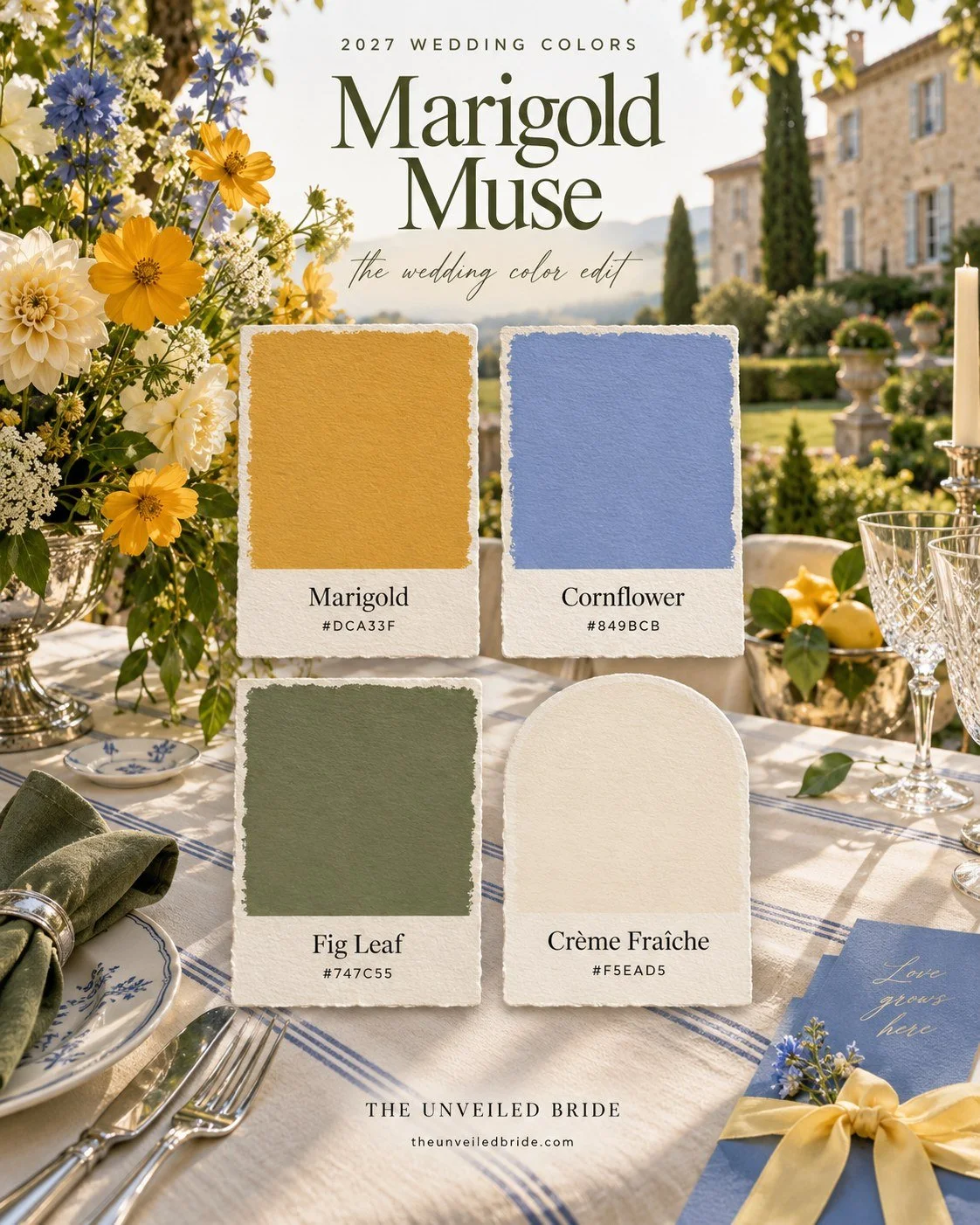
Marigold and cornflower feel like the happiest late-summer afternoon. The fig green gives them a lovely earthy note, and crème fraîche softens the whole thing. If you loved Sapphire & Soufflé but want something a little warmer and more garden-inspired, this is the one to save.
The colors: Marigold #DCA33F; Cornflower #849BCB; Fig Leaf #747C55; Crème Fraîche #F5EAD5.
I would use it for: Country houses and outdoor garden weddings. Season ideas: Summer and early fall.
How I would style it
Use crème fraîche linen with a small blue stripe, marigold and cream flowers, and fig-green napkins. Cornflower can show up in the paper, a few floral stems, or bridesmaid dresses. Keep the yellow golden and the blue slightly softened to stay close to this palette.
The detail I love: A cornflower menu with a soft yellow ribbon. I would want one at every place setting.
How to choose your wedding colors without starting over every week
First, narrow it down to three. You do not have to choose your forever favorite color combination today. You just need a shortlist that makes sense for the wedding you are planning.
Look at the room before you order anything
Your venue already has colors. The floors, walls, chairs, garden, and even the view will be part of the day. Put a photo of the space beside your favorite palette. If you love them together, you are getting somewhere. If you keep imagining covering half the room, try another combination before buying decor.
Give each color a job
Four colors does not mean four equal parts. Pick the shade you want to see most, a supporting color, a small accent, and a neutral. With Cherry Silk, that might mean ice blue linen, pink flowers, cherry ribbon, and ivory paper. The palette becomes much easier to use once every color has a place.
Order a few real samples
The hex codes are useful for digital planning and stationery references. Fabric, flowers, paper, and metal will look different from a screen and from one another. Put your dress swatches, napkin sample, and paper together in daylight, then look at them in the kind of light your reception will have. You are looking for colors that feel beautiful together, not a perfect screen match.
Repeat a detail you love
A stripe on the invitation can come back on the menu. A velvet ribbon can tie the bouquet and the napkins together. Repeating one or two small details gives the day a lovely sense of connection without buying everything in the same color.
2027 wedding color questions
What are good spring wedding colors for 2027?
For spring, I would start with Pearls & Pistachio, Rosewater Social Club, or Wisteria & Wasabi. Pale green and ivory feel fresh, pink and meadow green are beautifully romantic, and lavender with chartreuse gives a garden wedding a more playful direction.
What are good summer wedding colors for 2027?
Sapphire & Soufflé, Guava Gala, Teal Amour, and Marigold Muse are my summer picks. Blue and butter yellow, coral and papaya, teal and apricot, or golden yellow and cornflower all give you plenty of color to work with for an outdoor reception.
What are good fall and winter wedding colors for 2027?
Try Copper Moon for copper, dusty blue, and mulberry; Lilac After Hours for lilac and chocolate brown; or Cherry Silk for burgundy with blush and ice blue. You can make each one lighter or moodier by changing the main linen color and how much of the darker shade you use.
How many colors should be in a wedding palette?
Three or four is a useful starting point. This collection uses four so you have a main color, supporting shade, accent, and neutral to work with. You can simplify a palette if that feels better for your venue or your taste. You do not need every shade in every detail.
Do bridesmaid dresses have to match the wedding colors exactly?
No. They can sit within the palette without being identical to the flowers or napkins. A few related shades can look beautiful together. Order fabric swatches before choosing a mix, especially if you are buying dresses from different brands.
Can I use a summer palette for a winter wedding?
Absolutely. The season suggestions are just places to start. Sapphire and buttercream can feel lovely indoors with heavier fabric and candlelight, while a pale pink palette can be beautiful in winter. Your venue, fabrics, and lighting will do a lot of the work.
Which one feels like your wedding?
I keep coming back to Lilac After Hours, but Wisteria & Wasabi is making a very strong case. And I would like to be invited to the Guava Gala wedding, please.
Save your favorite palette to your wedding board, send it to your person, and see which one you are both still thinking about tomorrow. You can bring this guide to your florist or planner as a starting point, then make it your own.
Concept imagery created for The Unveiled Bride. These are styled wedding ideas, rather than photographs of real weddings.
